
- Published on
[Flying Tiger] The color-used genius was in a general store

Roughly speaking
- Learn how to use colour from a Danish general store.
- About color management. Let's start by learning from black and white. You can just use complementary colors, brightness, and saturation.
- Scandinavian and Japanese colors. Colors change in cities.
Colorful Danish goods store
FlyingTiger is a general store popular among young women.
It originated in Denmark, and in Japan it mainly operates in major cities such as Shibuya, Shinjuku and Yokohama.
I always visit every time I go to Shibuya.
Most of the men in the store are me, and there are many families or junior and senior high school girls.
Why are you going to visit? As the title suggests, the colours are very good.
Kitchenware is particularly outstanding in its skill in coloring.
Kitchenware is a key to creating an appetite and dining atmosphere, and there are limited colors available.
A common pattern is that all the dishes are made into wood, or all the dishes are unified in black or white.
It's a classic that you can see in stylish shops to the fullest, but I feel like they'll try a little more multicolored ones.
FlyingTiger boldly tries out colorful colors, and feels he is paying attention to brightness and saturation.

Color Management

First, start with the hue. This is an element that you don't need to think about if you like black and white or brown (this is why it creates a sense of unity and makes you look stylish).
Basically, it's about hue. The circular arrangement results in the color cycle as a result of changing the color stepwise along the color similarity.
By making use of the symmetry of the circle, orange for blue and green for red, it becomes a complementary color, and it can accentuate the colors of each other.
If you use the main color: Complementary color = 9:1, you can get a sense of unity even with multiple colors.
Brightness
Next is brightness. Refers to the brightness of the color. If you use multiple colors, make sure the brightness is correct.
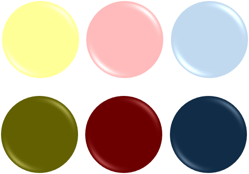
Saturation
A common source of uncles is a saturation error. Saturation refers to the vibrant color. The saturation is generally better to have a lower saturation.

The combination of brightness and saturation is called tone (color tone), and when the tones are all the same, they generally look good.
FlyingTiger is mostly for children, so both brightness and saturation are often high.
In fact, there is another color factor for FlyingTiger. Because it's Scandinavian.
Nordic colors, Japanese colors
Scandinavian colors are bright, but in winter it is often cloudy. Therefore, a bit of white may be added or transparency may be included.
Because Japanese colors come in four seasons, a variety of colors apply to Japanese colors. In other words, the saturation is much lower than that of Scandinavian Europe.
In addition to climates, the world's color usage changes depending on architecture, plants, animals, etc. For more information, see the color scheme notebook.
