
- Published on
【Book Review】【Font】Personifying fonts? Is Helvetica a princely pretty boy? "My Neighbor Helvetica" (Kuniichi Ashiya/Film Art)

In a nutshell
- When I walk around town, my eyes are drawn to colors and fonts. Fonts are interesting to learn about, but I can't convey that. That's when I happened to come across "My Neighbor Helvetica."
- A groundbreaking book that personifies fonts. But the content is solid, and you can learn the basics of Western fonts.
- Helvetica is a princely pretty boy, and Futura is a natural space girl. I get it.
I want to convey the fun of fonts, but how?
When you walk down the street, you run into fonts. Godiva's chocolate is Optima, and the station signs are mostly DIN.
Fonts are super important for brand logos. Supreme makes full use of Futura's slightly futuristic image. The BBC uses Gill Sans, which gives a sense of traditional British journalism.
While advancing my career as an engineer, I ended up getting hooked on design, which I had always wanted to do, and I studied colors and fonts like crazy.
When I was in high school, I wanted to be a car designer and was thinking of going to art and engineering school, and I still want to design a car someday.
Well, the only thing I can do now is buy a well-designed Uniqlo T-shirt on a limited budget (by the way, the Timothy Goodman collaboration Uniqlo T-shirt was wonderful).

I once hated the font on my company PC (Win) so much that I messed with the registry and could never get it back (I don't think anyone has noticed yet).
But there are few opportunities to learn about fonts. Honestly, you can start studying by googling the fonts of your favorite brands and playing around with them in various design tools.
First, I think that if you learn the representative Western fonts, you will enjoy buying clothes and things even more.
I happened to find out about it online and thought, "This is a godsend of a book that can convey the fun of fonts!"
I immediately rushed to a bookstore, had them check the stock, and at the third store, I got the last copy. It was "My Neighbor Helvetica."
Personifying fonts. My Neighbor Helvetica
What a groundbreaking approach. Personifying fonts makes them so much easier to understand. Until now, most books about fonts were font books that designers would use for work, so there were few that broadened the scope of interest.
I often feel the same way in the context of affordances, but I'll leave that for another article.
The structure of this book is that a person with the name of a font appears as a manga character, and it depicts the circumstances under which they were born, where they are used, what their personality is like, and so on. And at the end, there is a proper explanation of two pages each.
You can get an idea of the book from the official website that you can fly to from the image below. In fact, the Helvetica chapter is open to the public on the official website, so if you are interested, why not take a look? 
Helvetica is a princely pretty boy
Helvetica is apparently a princely pretty boy. I think Helvetica is the most used and loved Western font. Above all, it has a smart and honor student image.
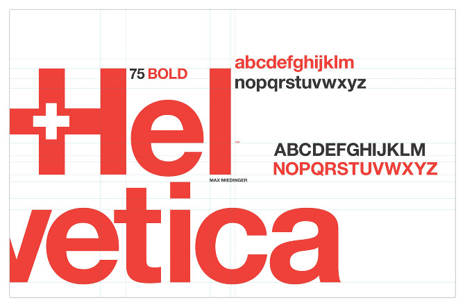
The most famous logo that uses this is undoubtedly Lufthansa. It gives the impression of a smart airline. 
Do you know Futura? This is a font that was born in 1927 with a priority on a futuristic image. The creator, the German Paul Renner, was influenced by the Bauhaus and created a geometric font that utilized functional beauty. By the way, I like Bauhaus design the most, and I often look at the Bauhaus creative commons web art book and grin. 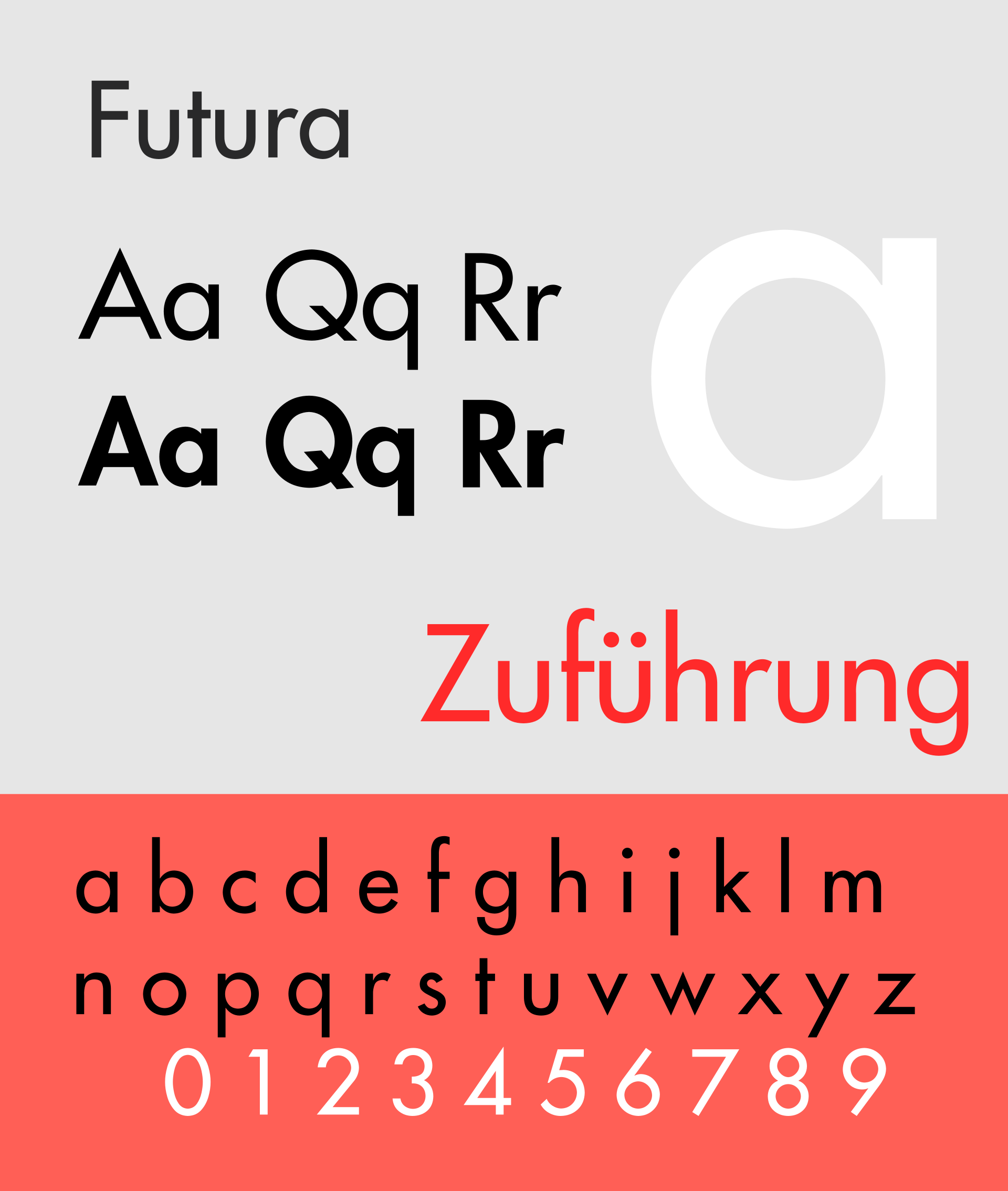
Logos that use this include Supreme. It is an amazing design that continues to have a futuristic image even today.
![]()
In the movie world, the famous director Stanley Kubrick's "2001: A Space Odyssey" uses Futura. It was probably because he liked the futuristic image.

Aside
This book is in short supply now, so it's hard to find in bookstores, and the price on Amazon is starting to become a premium (as of 2019/10/25, the list price is 1,700 yen, but it's selling for 2,800 yen), so I hope they reprint it.
Aside (Recommended Book)
A recommended design book. It's packed with design tips that you can use forever. I use it often myself.
